Fintech compliance 0 → 1:
Building a compliance platform that safeguards a fintech's growth from 300+ to 480+ institutional clients

My responsibility
Sole product designer, owning design strategy, user research, and all design deliverables.
Team
Worked with PM and engineers to ship this product in Apr 2025
Design stack
Figma, Claude (product research, workflow ideation, prototyping)
Timeline
Jan-Apr 2025 first version, 12 features shipped since
Solution

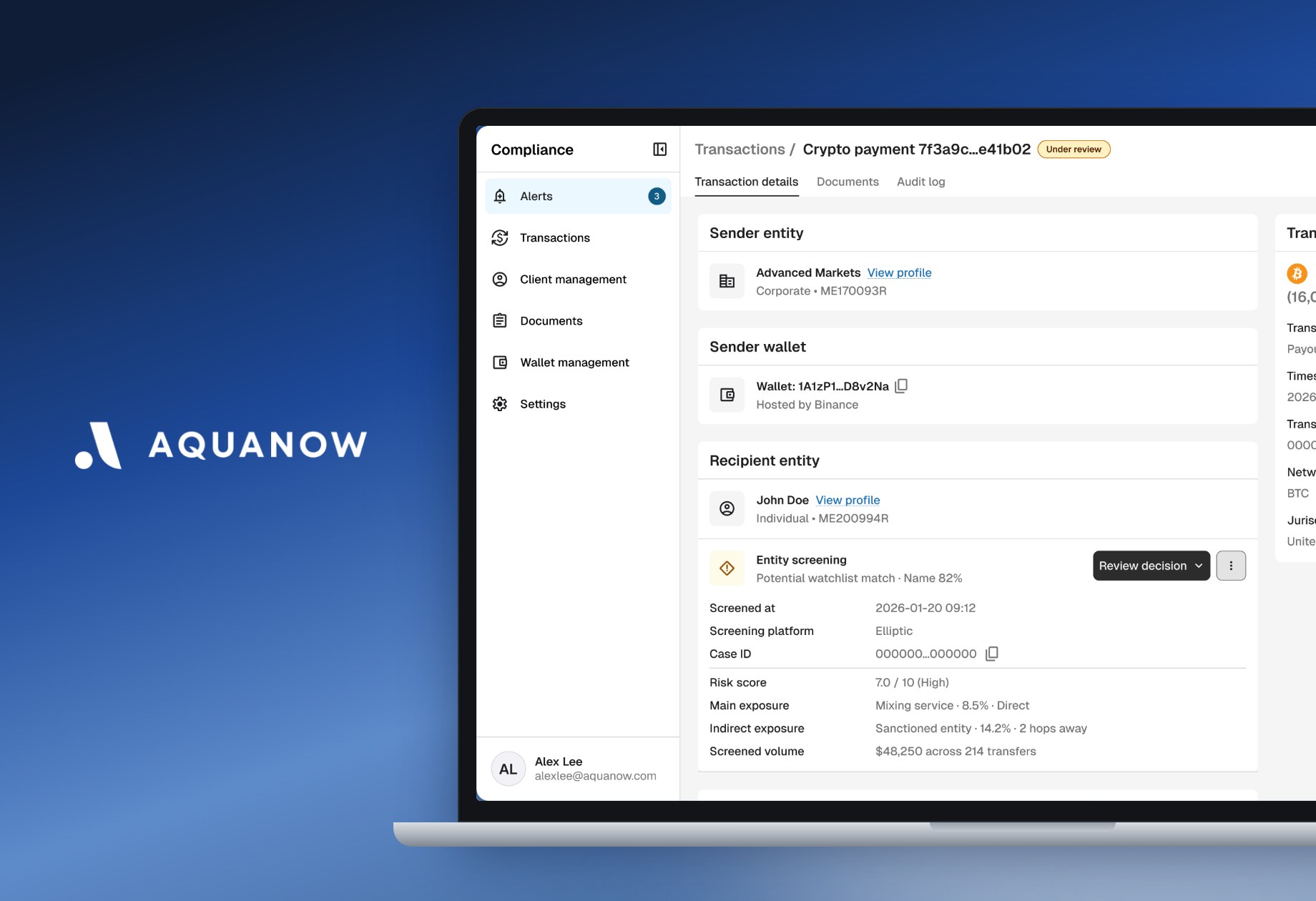
A compliance platform that automates compliance checks and consolidates 5 platforms into 1 interface
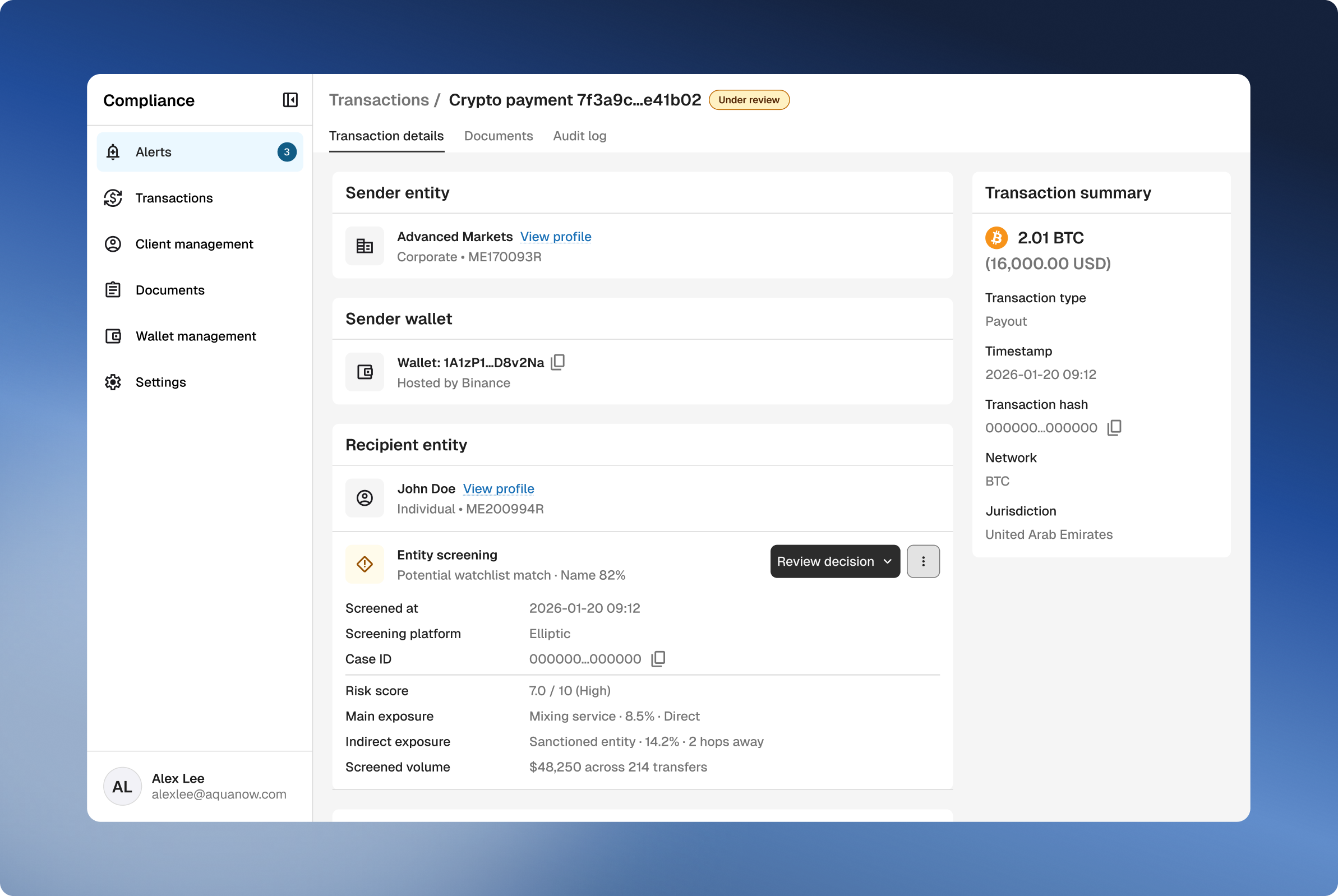
The compliance platform's transaction review screen: sender and recipient entities, wallets, and an entity screening result with a review decision action
🚀
Business impact
44%
Faster case reviews
Average review time dropped from 25 to 14 minutes per case.
1.3×
Clients per analyst
The client base grew 60% (300+ → 480+) while the analyst team grew only 20%.
Project context

Aquanow powers crypto payment services for 480+ businesses, and compliance was holding back its growth

Every Aquanow client and transaction has to pass compliance screening: checks that compare people, companies, and crypto wallets against sanctions lists and risk databases. When a screening flags a risk, a compliance analyst reviews the case and decides whether the money can move.

As volume grew, keeping up meant hiring more and more analysts. To stay compliant without operating costs climbing with it, the company made automating compliance a top priority.
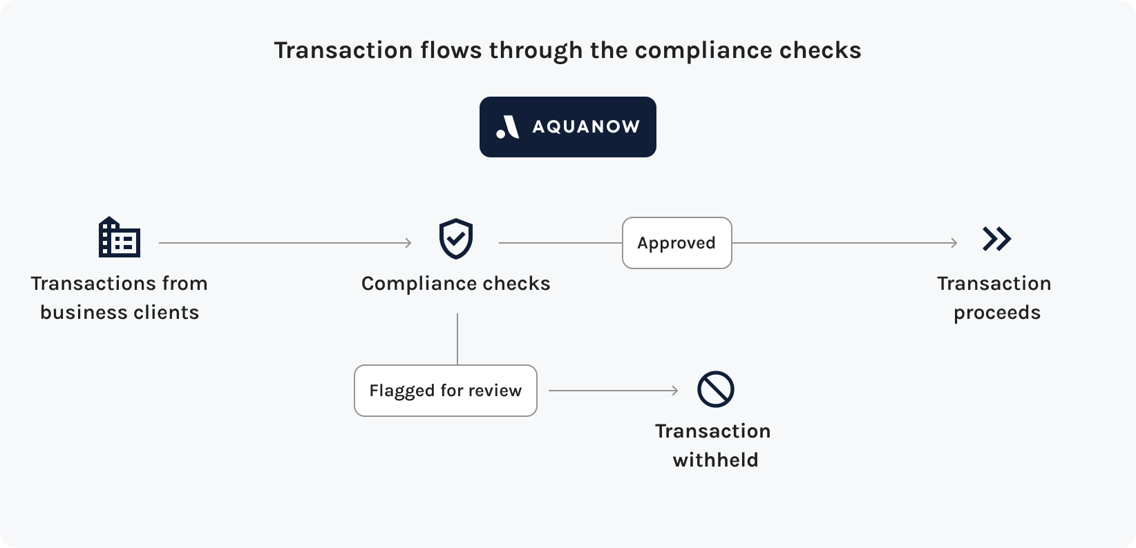
Diagram: transactions from business clients pass through Aquanow's compliance checks; approved transactions proceed, flagged ones are reviewed and may be withheld
Problem

One case review meant switching between five platforms

Analysts screened clients and transactions with several external services, stored information in Google Drive, and made decisions in yet another platform. Every switch added time and room for error, and slower reviews forced the company to keep hiring analysts.
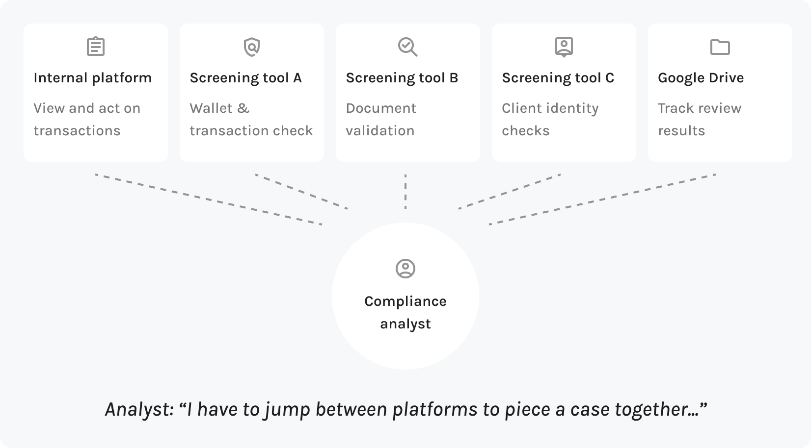
Diagram: a compliance analyst juggling an internal platform, three screening tools, and Google Drive. Analyst quote: I have to jump between platforms to piece a case together
🏁
Project goal
How might we streamline case reviews so compliance keeps up with the business’s growth?
🗺️
Chapter 1
Information architecture
User research

Before rushing to the first feature, let’s understand the end-to-end compliance flow

The dev team was eager to start building, but compliance was new to all of us. I pushed to map how compliance works end to end before committing to any feature, so the team could see the full scope and every feature would land where it belongs.

User interviews
👩‍💼 Participants
  • 1 Compliance lead
  • 4 Compliance analysts
💭 Key questions
  • Walk me through the compliance tasks. Where does the work come from, and where does it go? → mapped the end-to-end flow (IA)
  • What checks do you run to keep us compliant? → defined the product’s future scope
  • Where does your time feel mechanical, and where must a human make the call? → drew the line between automation and human review
Translating user insights

Decision 1: Link all data to client records

📝
User insight:
Analysts can't judge a transaction on its own. One that looks normal in isolation can be a red flag within a client's history, and audits are reviewed client by client.
✨
IA decision:
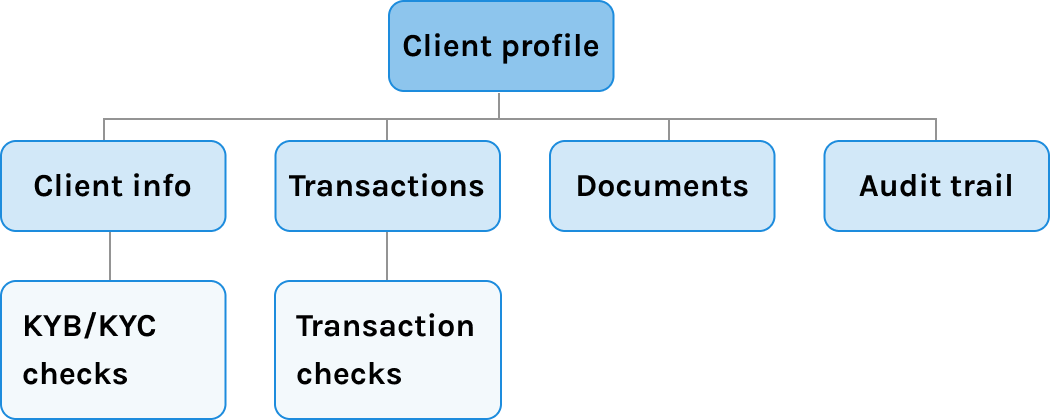
I made the client record the core container: info, transactions, documents, and cases all live under it, so any review can pull up the full client picture.
Site map: Client profile at the top, with Client info, Transactions, Documents, and Audit trail beneath it; KYB/KYC checks under Client info and Transaction checks under Transactions
Translating user insights

Decision 2: Alert-first navigation

📝
User insight:
All 4 analysts described their day the same way, "My day starts with alerts." Alerts drive their work; they don't browse data looking for it.
✨
IA decision:
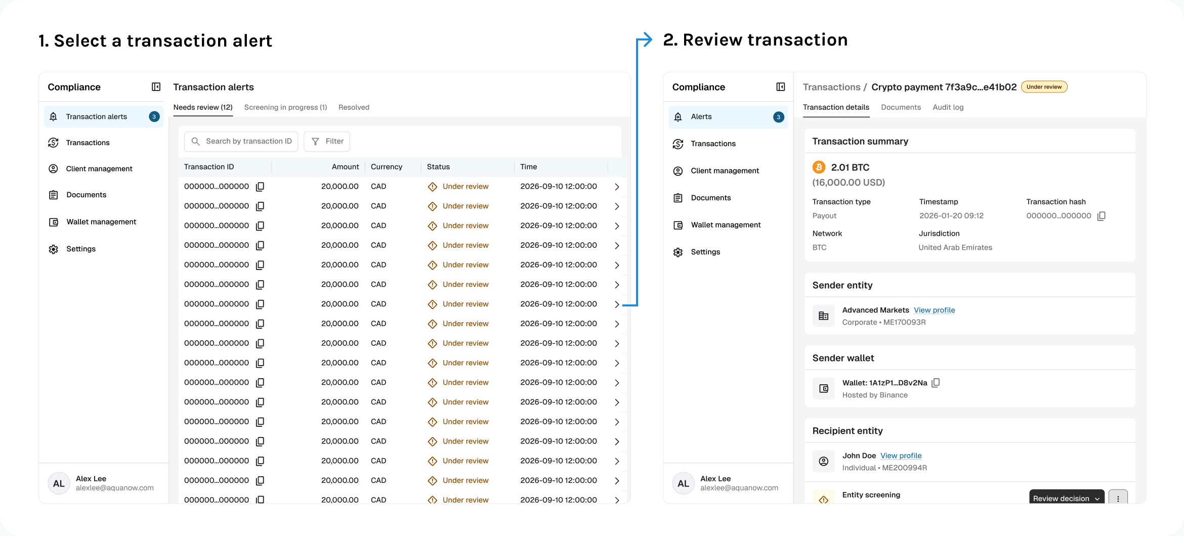
I made the alert queue the home page, and each alert opens straight to the case under review. The client record still organizes the data, but alerts are how work arrives, so analysts never have to drill from client to transaction to screening.
Two screens: 1. select a transaction alert from the alert queue, 2. it opens directly to the transaction under review
Outcome

A blueprint for scaling from MVP to the ideal state

Mapping the IA helped the team picture the “end game” for this product and agree on the MVP skeleton: client > transaction > screenings.

Since then, the site map has been our blueprint whenever a new feature comes up. 12 features later, the platform still hasn’t needed a major restructure.
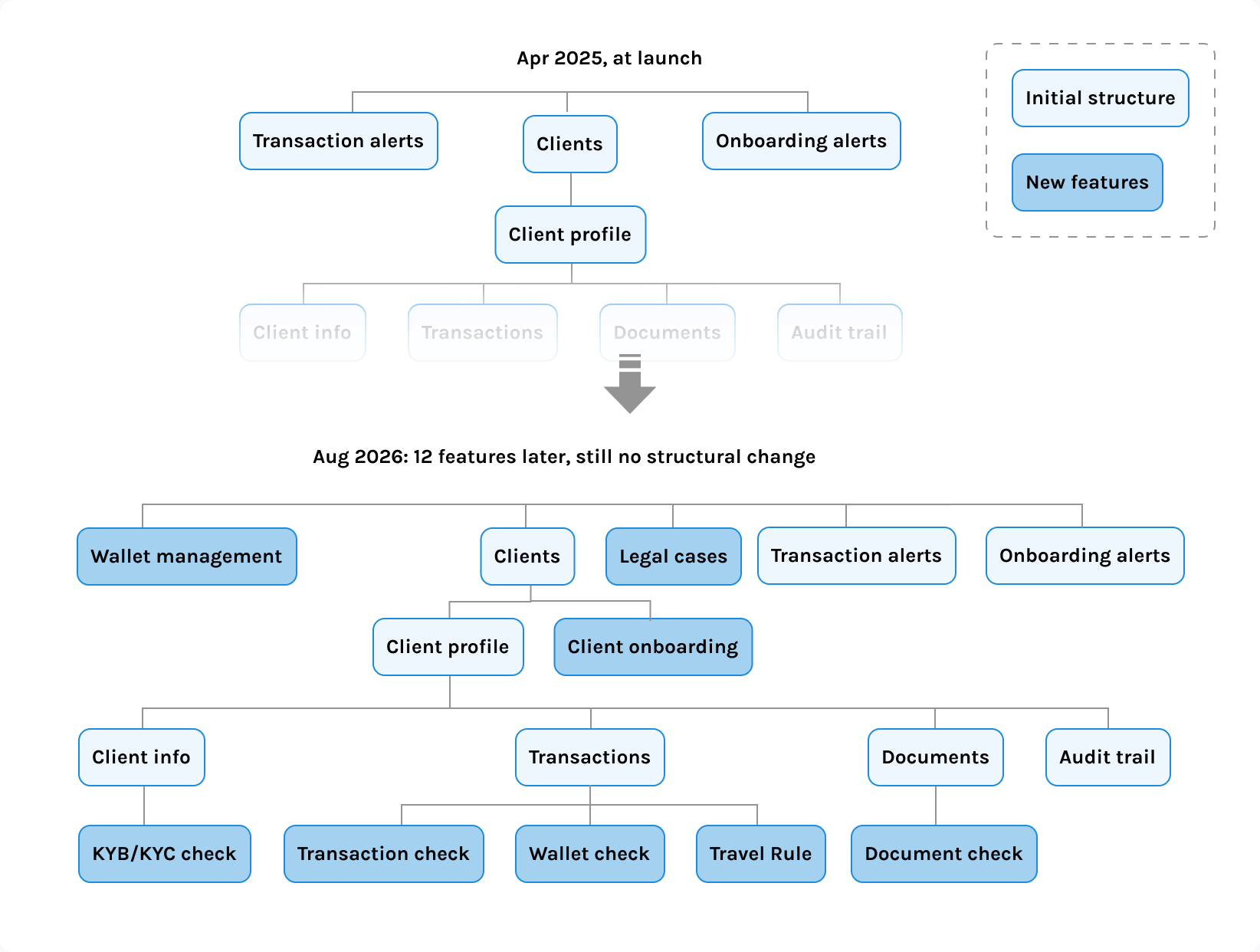
Site map at launch in April 2025 compared with August 2026: twelve new features such as wallet management, legal cases, and travel rule checks were added without changing the structure
🗺️
Chapter 2
Making transaction alerts easier to review
Design challenge

Three screening tools, three different ways to review. How do we make them feel like one?

Each external tool presented results and actions differently, so analysts had learned a separate way to use each one. Bringing those checks into one platform meant giving analysts a familiar way to understand the findings and act on them, while preserving the details specific to each check.
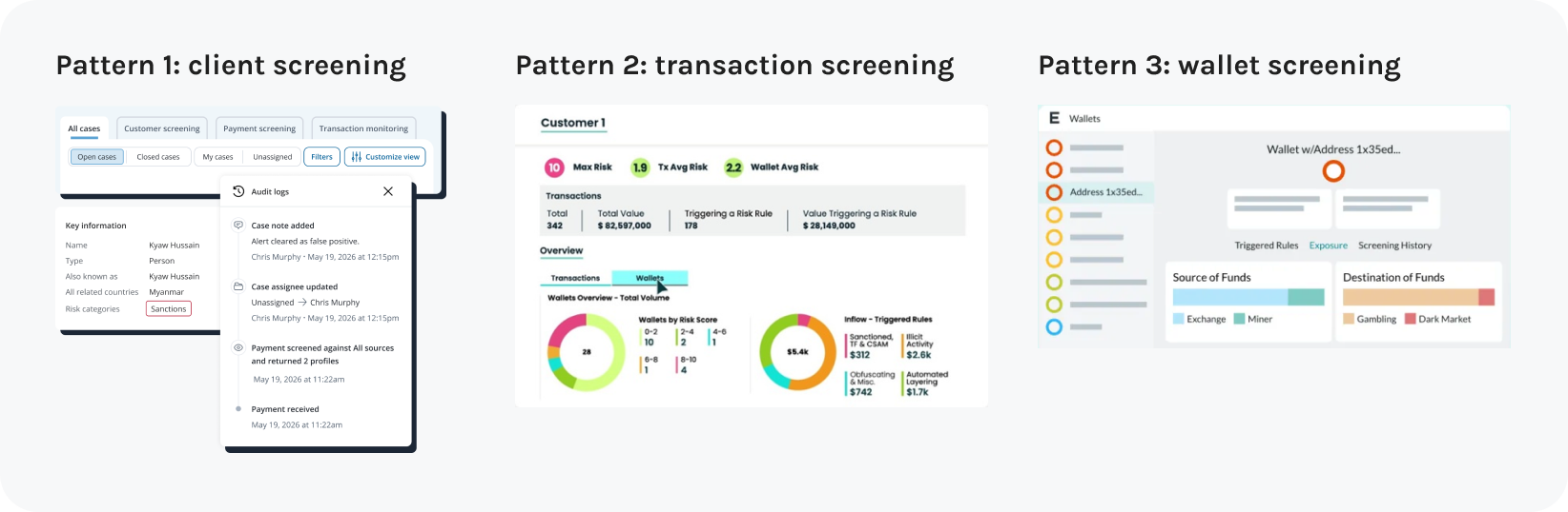
Three external tools with different layouts: client screening, transaction screening, and wallet screening
Where it lives

Give each screening its own section, close to what it checks

I first placed screening results directly in the wallet details so analysts could see what was wrong at a glance. In review, the PM spotted two gaps: once more checks arrived, results and actions would be hard to tell apart, and hiding results after a decision would make past reviews hard to revisit.

To get ahead of both, I stress-tested the layout against the screenings on our roadmap. The answer was to give each check its own section within the wallet, so multiple screenings can sit side by side and every result stays on record for audits.
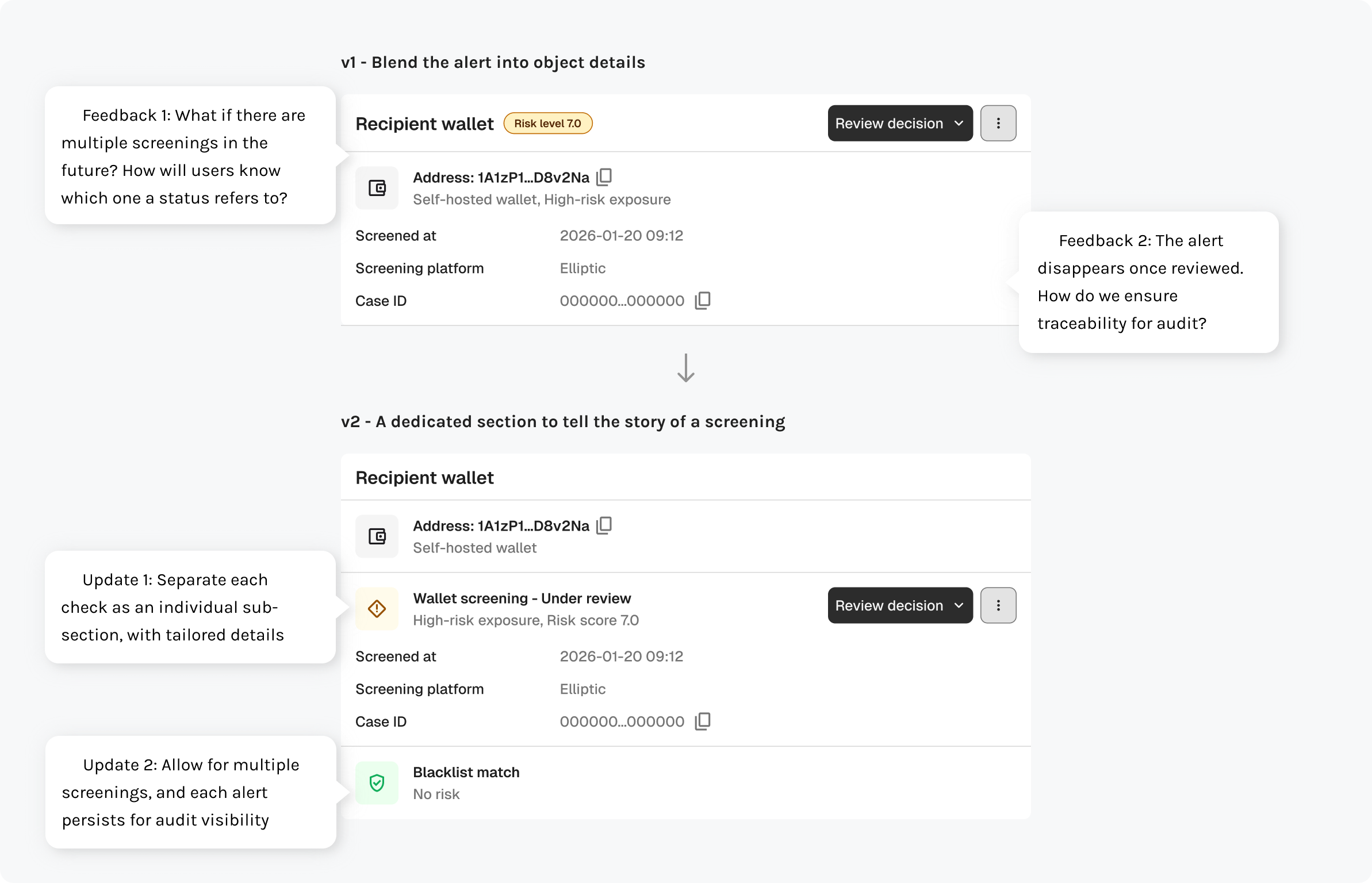
v1 blended the alert into the wallet details; PM feedback flagged multiple screenings and audit traceability. v2 gives each screening its own sub-section and keeps every alert on record
How it behaves

Every state tells analysts what happened and what to do next

For accurate reviews, clear results alone weren’t enough: analysts also needed to know whether a check was still running, needed their judgment, or had failed to complete.

That’s why I worked with backend engineers to map the screening lifecycle and define the information and actions available at each state. For example, analysts can tell a system error from a risky result at a glance, and they always have a way to recover.
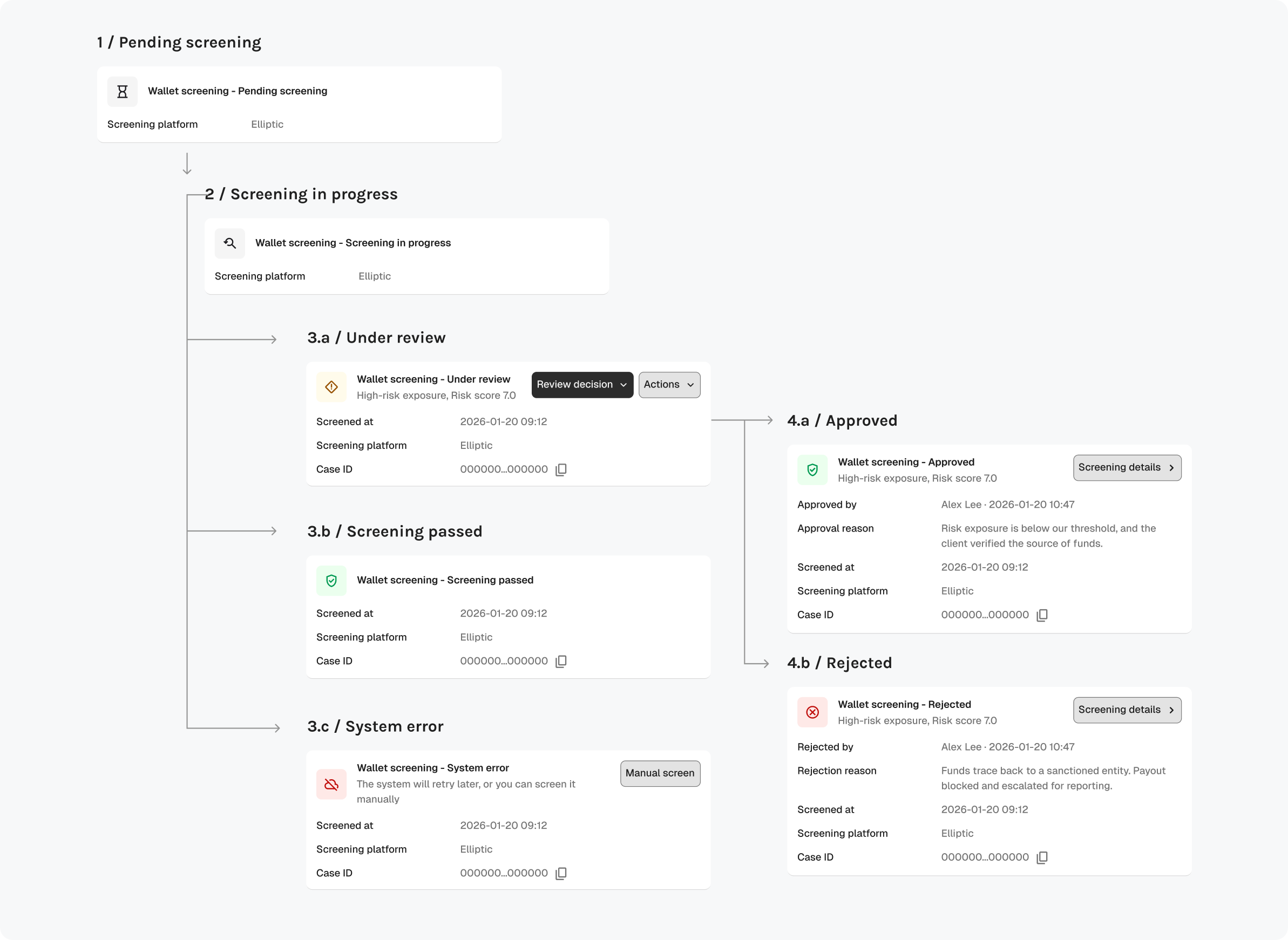
Screening lifecycle: pending, in progress, then under review, passed, or system error; reviews end as approved or rejected, each state with its own details and actions
What it shows

Turn screening alerts into a shared pattern

Six months after v1, more screenings had shipped, and their details had drifted apart: some showed who reviewed them and when, others didn’t. I proposed a standard pattern with a shared core for status, review details, and actions, plus room for each check’s own findings. We rolled it out across every compliance check, from transactions to onboarding to client monitoring.
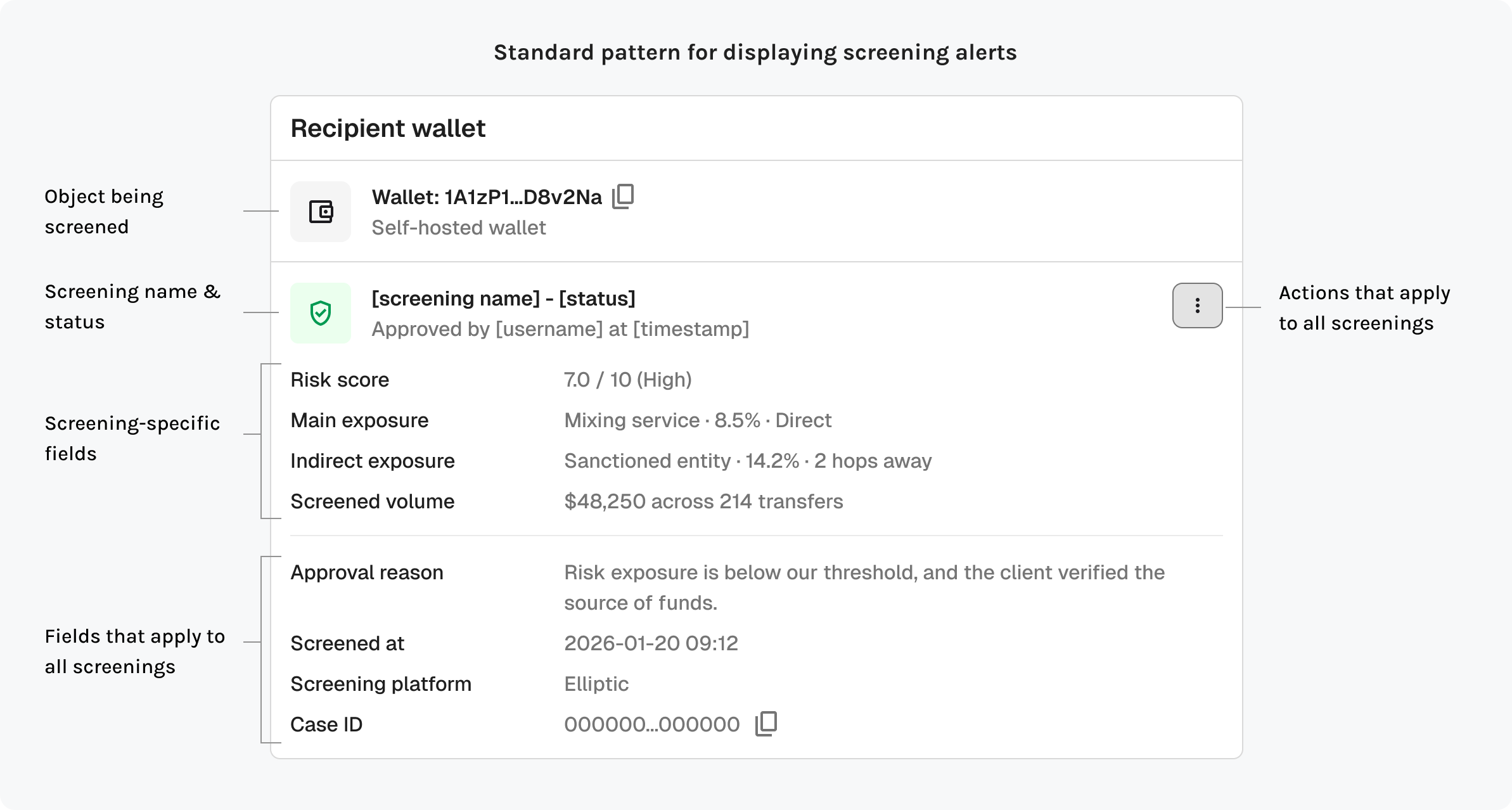
Annotated standard pattern for screening alerts: object being screened, screening name and status, screening-specific fields, fields shared by all screenings, and actions that apply to all screenings
Outcome

Clear alert display and actions that help move through a case review

Outcome

Track alert history for full audit visibility

Takeaways

✨
Map the system before the feature
Mapping the whole compliance flow before building gave us an IA that has carried 12 features without a major restructure. That early investment meant every new feature had a clear place to land.
✨
Test a reusable pattern against a second real case
I planned for growth in the architecture, but not in the screening patterns. Working through more use cases of a pattern showed me what should stay consistent and what needs room to vary.